Beginner-friendly investment app
Role: UX research, visual design
Duration: 6 weeks
Tools Used: Figma, After Effects
PROBLEM
Novice investors often make impulsive or uninformed financial decisions and lose their money when starting to invest in stocks.
Many new investors make common mistakes when starting their investment journey, such as buying high-risk stocks, putting in a large amount of money right away, or not diversifying their portfolio. These mistakes often lead to significant investment losses, leaving investment app users frustrated and demotivated. As a result, a lot of people have become convinced that you cannot succeed at investing as a beginner as it requires a lot of knowledge and prior experience.
GOAL
The goal is to design an investment app for Raiffeisen Bank tailored to the needs of beginners by combining educational resources, risk management tools, tangible tips, and user-friendly analytics. App users should be able to learn about the stock market with minimal time commitment, explore various financial tools, develop smart investment habits, and reduce the risk of making uninformed financial decisions.
AUDIENCE
The audience is working adults between the ages of 21 and 45 with average or above average income, who have considered investing in stocks as a way to grow their savings, but lack knowledge or any practical experience in that area.
USER INTERVIEWS
When it comes to finances, we all tend to think twice before taking any sort of risk. When I was starting to dabble in the world of investing a couple of years ago, I didn’t know how to make smart choices and was scared to lose my savings.
With Raiffeisen Invest I wanted to ensure that novice investors have a solid understanding of how the stock market works and what level of risk comes with each type of assets. In order to define and address specific challenges that stop people from investing, I recruited participants through social media and conducted 12 interviews.
Here are some of the concerns they mentioned:
“I always wanted to start investing, but I am so busy with my job and being a new mom that I have no time to even watch videos and read books about it.”
“I have no idea what stocks to buy and I am afraid I’ll lose all my money if I make the wrong decision and just invest in the most popular stocks.”
“To be honest, I am intimidated by those charts you see on the news when they talk about stocks. I’m not in finance and I don’t understand them.”
“Investing is probably for very wealthy people. I don’t have several thousand dollars just lying around that I can put towards that.”
“Where do I even start? I wish someone could guide me through every step and teach me what I need to know before I actually invest.”
After conducting interviews and organizing all my notes I defined three common themes:
Many users hesitate to start investing because they think it requires a lot of prior finance experience and professional expertise.
1
Novice investors need guidance and some sort of structure in order to learn the basics and start investing.
2
People assume that there is a specific unattainable for them amount of money they’d have to invest to get started.
3
COMPETITIVE AUDIT
While the primary research findings helped me come up with some insights, I was looking for more inspiration before I started wireframing. I took a look at some of our direct and indirect competitors like Robinhood, Cash App, and Public to understand how other finance and investment apps go about attracting and retaining beginners.
Audit insights:
Simple onboarding, helpful hints, and engaging educational materials help to take the pressure to know everything about investing off the new users.
Complex data such as portfolio analytics and stock charts will be intimidating to novice investors unless they are presented in a simple, user-friendly way.
It’s beneficial to have a live chat and a tech support team available for users to feel secure about their finances and know that they can always ask for help.
Avoiding jargon, incorporating interactive activities, and using illustrations are good strategies to prevent users from getting overwhelmed and keep them engaged.
1
2
3
4
INFORMATION ARCHITECTURE
Based on the research findings, I decided to create a solid structure and have a Learning Center within the app that contains answers to FAQs and concise educational courses so that users know exactly where to start their investment journey.
CONCEPT SKETCHES
I started the prototyping stage by creating Lo-Fi paper wireframes as it is quick and allows for rapid iterations. My main goal here was to get a better idea of the layout of the pages and visualize the structure of the app I had in mind.
LOW-FIDELITY WIREFRAMES
When working on digital wireframes and preparing for the first round of usability testing, my primary focus was on the main user flow where a new user would go through onboarding, take a risk tolerance quiz, and proceed to the Learning Center to look at available courses and lessons about investing.
USABILITY STUDY
I created a low-fidelity prototype and conducted a moderated usability study with 6 participants over Zoom to test the main user flow of completing onboarding, taking a risk tolerance quiz, and starting a course in the Learning Center as well as a user flow of purchasing stocks. After reviewing the results, I came up with valuable insights and defined what iterations I needed to make.
Usability study insights:
Users may not want to take Risk Assessment Quiz right at the beginning and look at the app’s interface and features first. Therefore, there should be an option to come back to it and take the quiz later on, from the Settings page or the Learning Center.
1
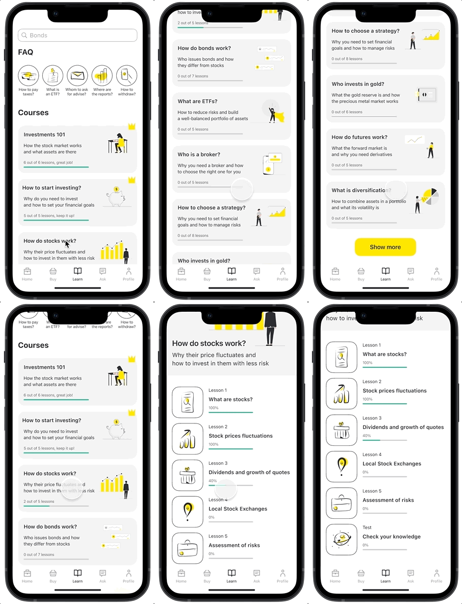
There should be progress indicators under the description of each course to show users which courses they have already completed, which they have started, and which they haven’t opened yet. The same goes for each of the lessons in a course.
2
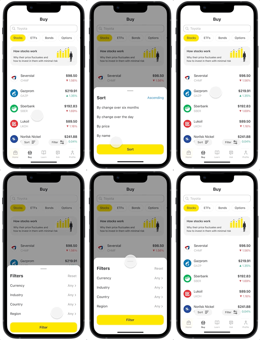
There should be options to filter stocks by country and region in addition to filtering by currency and industry on the Buy page. There should also be a Reset button to reset all previously applied filters with a single tap.
3
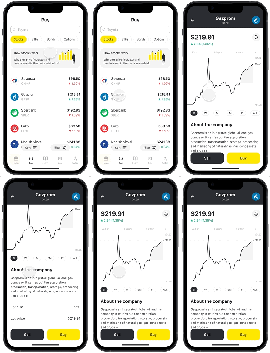
A stock card should have a field to type in how many lots of the stock a user wants to buy and what the total price of the lots is before they click the Buy button and proceed to the confirmation page.
4
STYLE GUIDE
FINAL DESIGNS
Overview of the main features
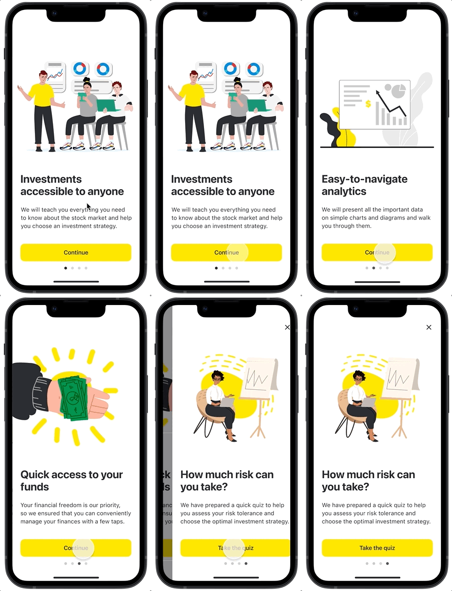
I created a short onboarding process to explain to users what they can expect and to make them feel cared for from the moment they join the app.
Choosing the right investment strategy
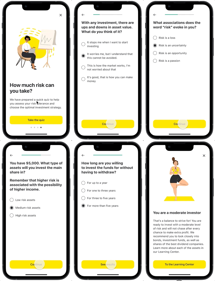
I decided to offer users to take a risk tolerance quiz before they proceed to the homepage. It helps them evaluate how prepared they are for risks that come with investing and provides advice on what assets to pay attention to.
Managing investment portfolio
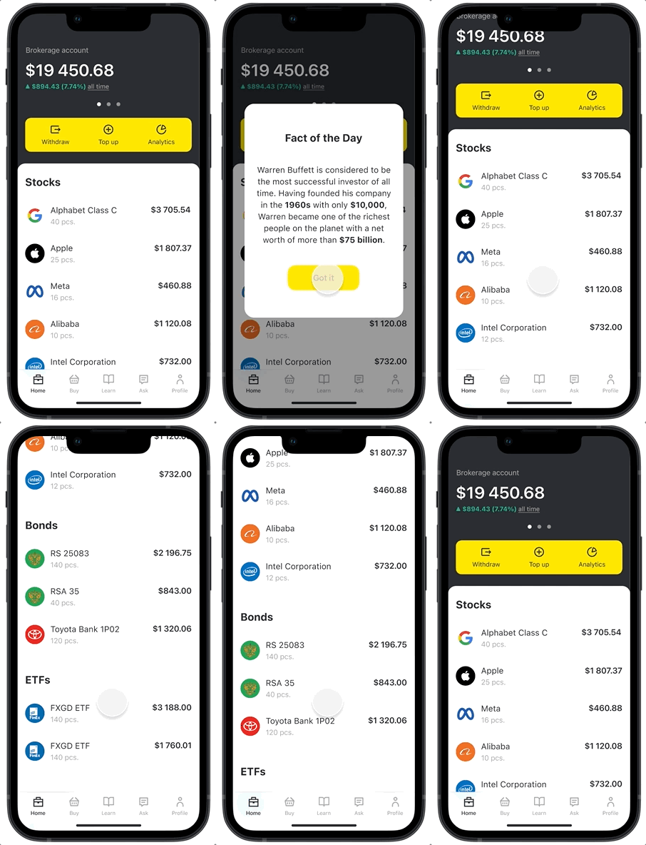
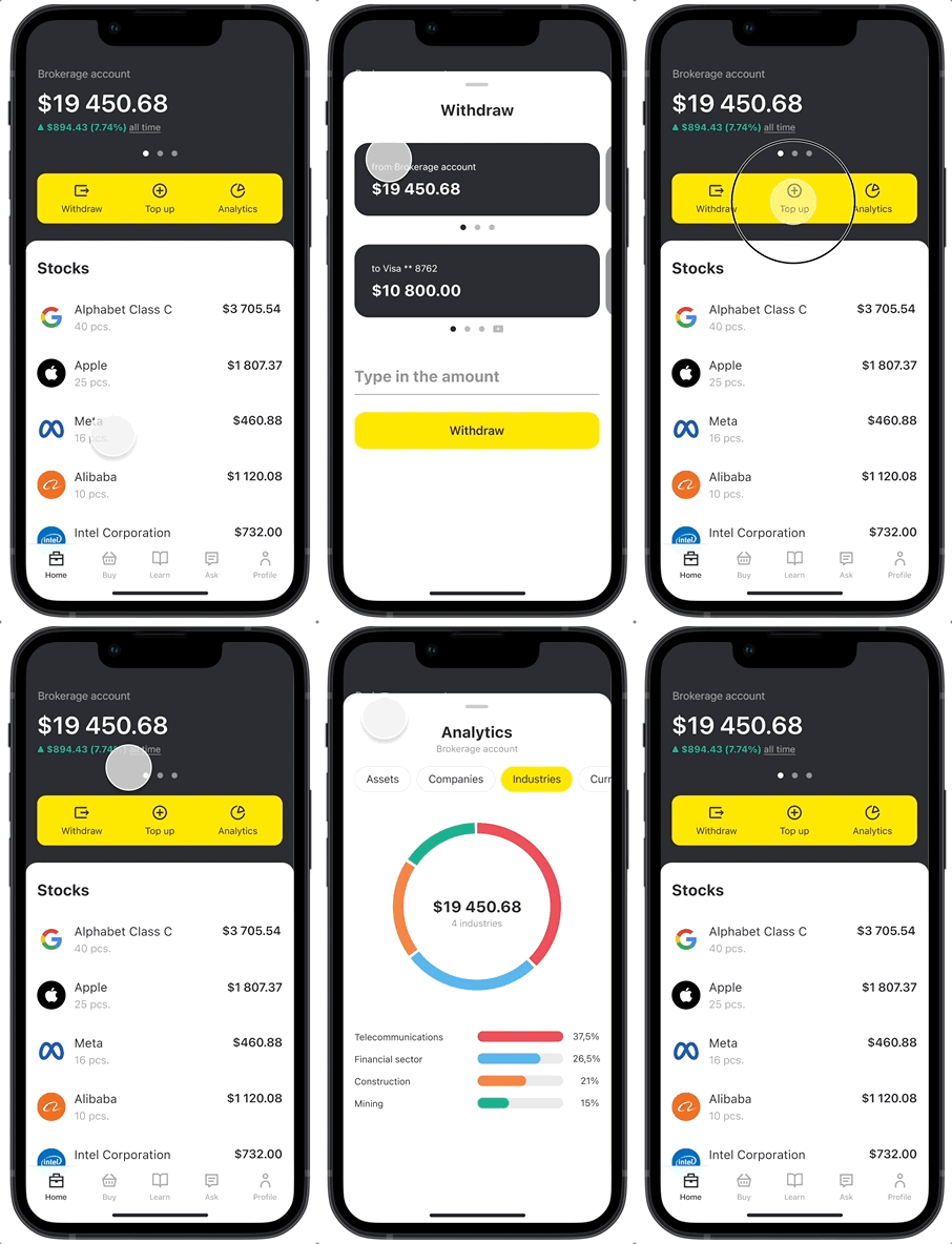
I wanted the homepage to be a go-to place for users to keep track of their investments. Users can scroll through purchased assets, swipe between multiple brokerage accounts, withdraw funds, and pull up portfolio analytics, all from the homepage.
Intuitive and familiar UI
The process of withdrawing funds resembles a simple money transfer on a bank app, which gives users a sense of security. Easy-to-read diagrams help them focus on their investment priorities.
Simple process to buy assets
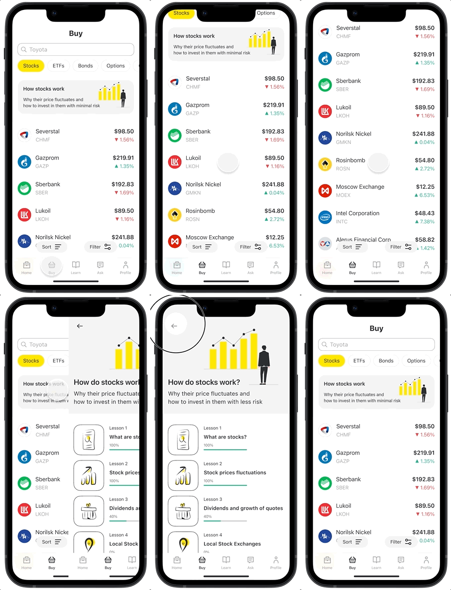
Users can switch between different types of assets and see their current value and yield. I added a featured short course at the top intended to help beginners learn the basics.
Customized search results
When deciding what assets to purchase, users can easily filter and sort stocks, narrowing down the selection to meet their criteria. I also added a Reset button after the first round of usability testing.
Making informed decisions
I designed easy-to-read stock charts to provide users with valuable insights into historical price trends, help them spot entry and exit opportunities, and track their investment performance more effectively.
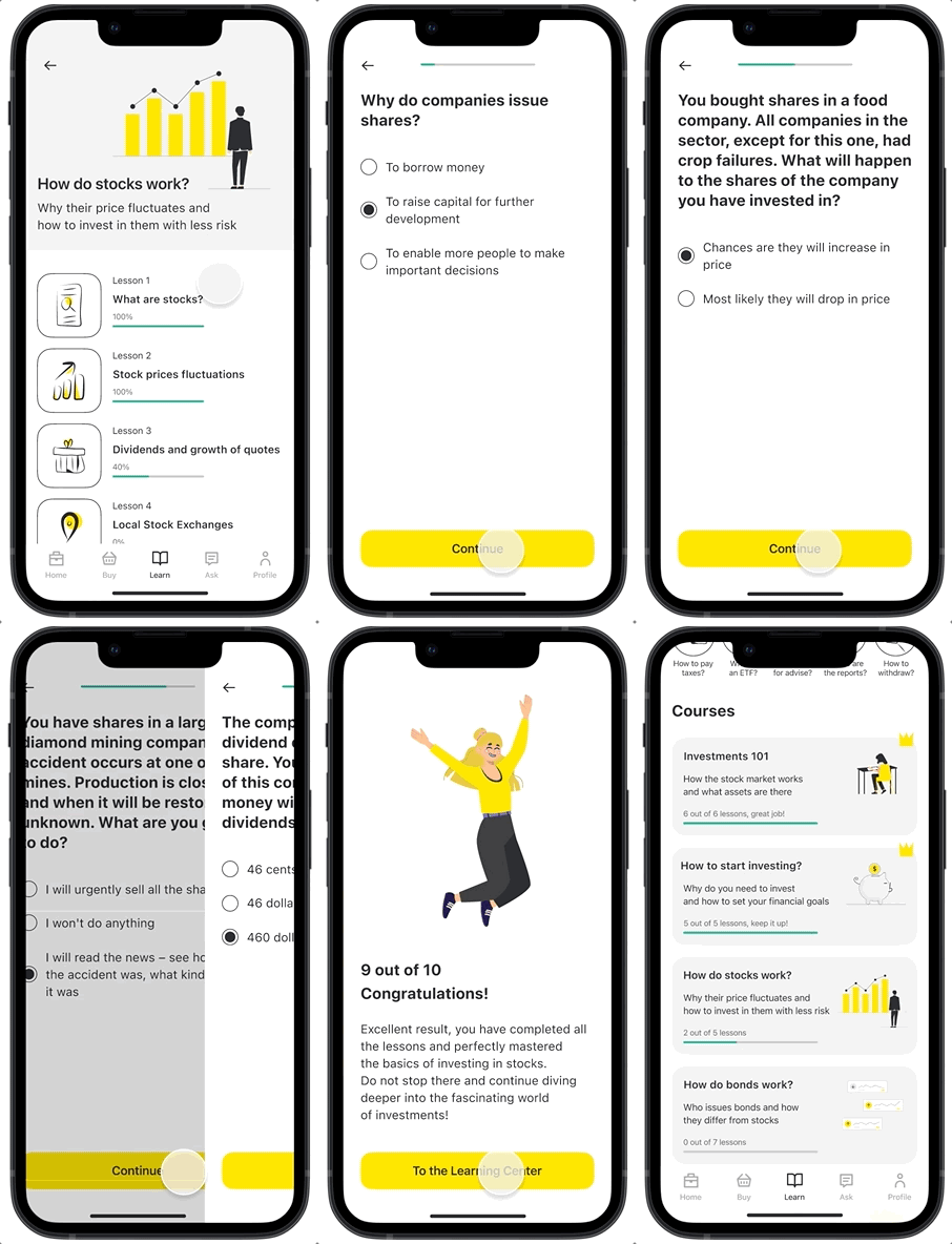
Investment courses
The Education Center has short, informative courses that cover all the basics, from portfolio types to investment strategies. I added green progress bars to each course to motivate novice investors to keep learning.
Fun tests and self-reflection
A self-assessment quiz at the end of each course is a good opportunity for users to solidify their knowledge. Each test has fun math problems and engaging exercises to prove that investing doesn’t have to be boring.
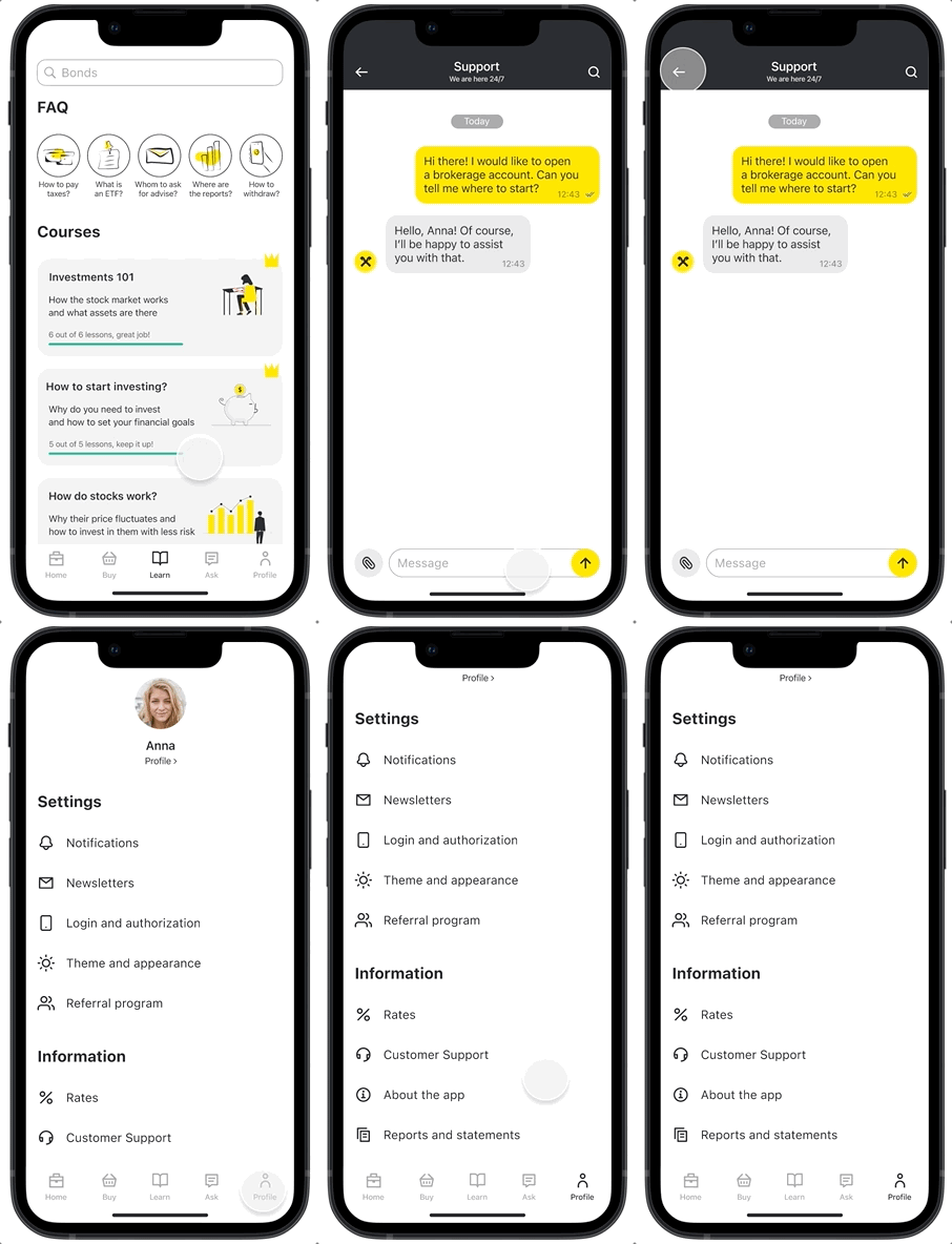
24/7 support and assistance
With a live chat feature, users can reach out for help anytime, get instant answers to their questions, and receive expert advice to make confident investment decisions.
REFLECTION
I am proud of the way the Raiffeisen Invest app turned out. It was user-focused from the start, and my design process was guided by the goal to make investing more accessible to everyone. The final product has proven to be easy to navigate for beginners, and the educational courses made the learning process well-structured and engaging. I learned a lot from working on this project myself and reflected on the areas where I need to improve next time.
Key takeaways:
I should have tested all possible scenarios during the second round of usability testing with a high-fidelity prototype and not just the two main user flows. I missed several minor details that I had to fix later on, such as adding an option to go back to a previous question when taking a quiz and attaching a document or a picture in a live chat.
1
I should have addressed one of the main user concerns about having to invest a large amount of money earlier on, during onboarding, instead of making it a part of the first course. The assumption that investing requires a certain minimal amount of money can stop many users from creating a brokerage account and should be clarified as early as possible.
2
I should have checked whether all of the colors I was using followed accessibility guidelines earlier in the design process. Since I checked that after creating high-fidelity designs, I ended up having to change the shade of grey I was using and update final mockups to make sure all my designs were accessible.
3
Thank you!
I hope you enjoyed learning about this project as much as I enjoyed working on it 🙂


