Outdoor wedding venue mobile app
Role: concept, UX research, visual design
Duration: 4 weeks
PROBLEM
Sterling Peak, a beautiful outdoor wedding venue, has a very limited online presence and is missing out on attracting a lot of potential clients.
Engaged couples and event planners can stumble upon the venue and learn some basic details about it by browsing through various wedding-related articles and blog posts, but they’d need to have access to more information, such as availability, pricing, detailed pictures, customizable options, and venue features to consider booking it for their special day.
GOAL
As smartphones have become our primary device for browsing the Internet, the goal of this project is to create a dedicated mobile app for Sterling Peak that will allow potential clients to learn everything they need about the venue, browse through pictures, read other couples’ reviews, and schedule an in-person visit prior to booking it for the wedding date.
AUDIENCE
The audience includes newly engaged individuals between the ages of 25 and 40 with average or high income, who live in California, Washington, or Oregon and plan on having an outdoor wedding. It also includes wedding and event planners who want to make the wedding planning process less stressful and daunting for their clients and themselves.
USER RESEARCH
To get a deeper understanding of the problem and the needs of the users, I conducted a survey and received responses from 24 people who recently got engaged. The survey provided valuable insights into their preferences and expectations regarding planning their wedding and the challenges they faced while looking for the perfect venue. Here are some of their answers and the data I collected:
Q: What are the top factors you consider when selecting an outdoor wedding venue?
Q: What specific information would you like to access when researching outdoor wedding venues?
Q: How often do you use your smartphone for wedding-related activities, such as browsing for venues or gathering inspiration?
Research insights:
Users want to find a wedding venue that is available on their desired date, particularly during peak wedding season. They also want to be able to check the venue’s availability online without having to call about it.
Wedding venues can be expensive, and pricing options are almost never provided online. Users want transparency when it comes to pricing, hoping to find venues that openly share their prices and package details.
With so many wedding venues to choose from, users struggle to find reliable reviews from other couples who have used a particular venue. They want to read about others’ experiences to make an informed decision.
USER PERSONA
After conducting user research, I organized the gathered data to create a well-defined persona that represented the target audience of the app. By developing this persona, I gained a deeper understanding of the users' mindset and was able to align the app's design and features to address their pain points and frustrations.
COMPETITIVE AUDIT
To gain a comprehensive understanding of the market, I conducted a thorough competitive audit. I closely examined two direct competitors, analyzing their strengths, weaknesses, and unique features. Additionally, I explored one indirect competitor to identify potential opportunities and gain insights into adjacent markets.
DIGITAL WIREFRAMES
When I started working on wireframes for the app, I wanted to focus on addressing all of the main concerns that users have expressed and ensure that the app includes transparent information on pricing, provides an option to schedule a tour of the venue, and allows users to check its availability for a specific wedding date.
USABILITY STUDY
I conducted a moderated usability study with five users to see how they would interact with the prototype and whether it would be easy for them to follow the main user flow. I had four prompts that I was sharing with the participants, recording their click path, observations, and quotes.
Changes I made to the prototype based on the usability study results:
I created a separate page called “Availability Calendar” where users could check whether the venue was available for their wedding date. Prior to that, users could only find the calendar by scrolling down on the homepage, which was not obvious to most usability study participants.
1
I provided clear instructions on the confirmation screen after a user schedules a visit to the venue, clarifying what the next steps are and what they should expect from the visit. I also ensured to ask users to list any accommodations they might need in the comment field.
2
I created photo albums of the weddings that had previously taken place at “Sterling Peak” instead of simply providing venue pictures to make it more heartfelt and personal. Real wedding pictures compliment clients’ reviews very well, providing a sense of security to new app users.
3
STYLE GUIDE
FINAL DESIGNS
When it came to developing the high-fidelity prototype, my main goal was to capture and convey the enchanting atmosphere of Sterling Peak through the app. I paid careful attention to the visual elements, such as a warm color scheme, clean typography, and captivating images, to create a design that would evoke the magical ambiance of the venue.
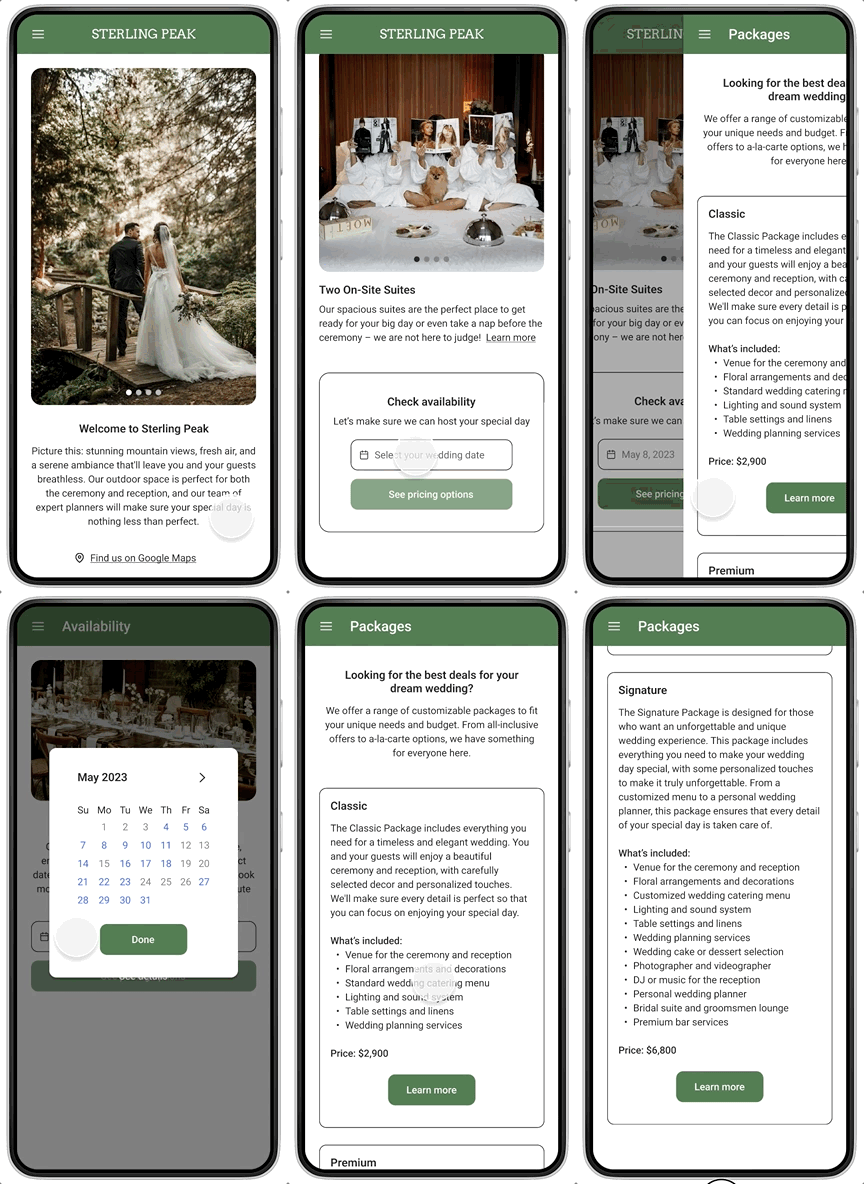
Checking venue availability
After usability testing, I created a separate page with the availability calendar, so that users could check whether the venue is available either from the homepage or from the navigation menu. After selecting the wedding date, they can learn more about the pricing packages.
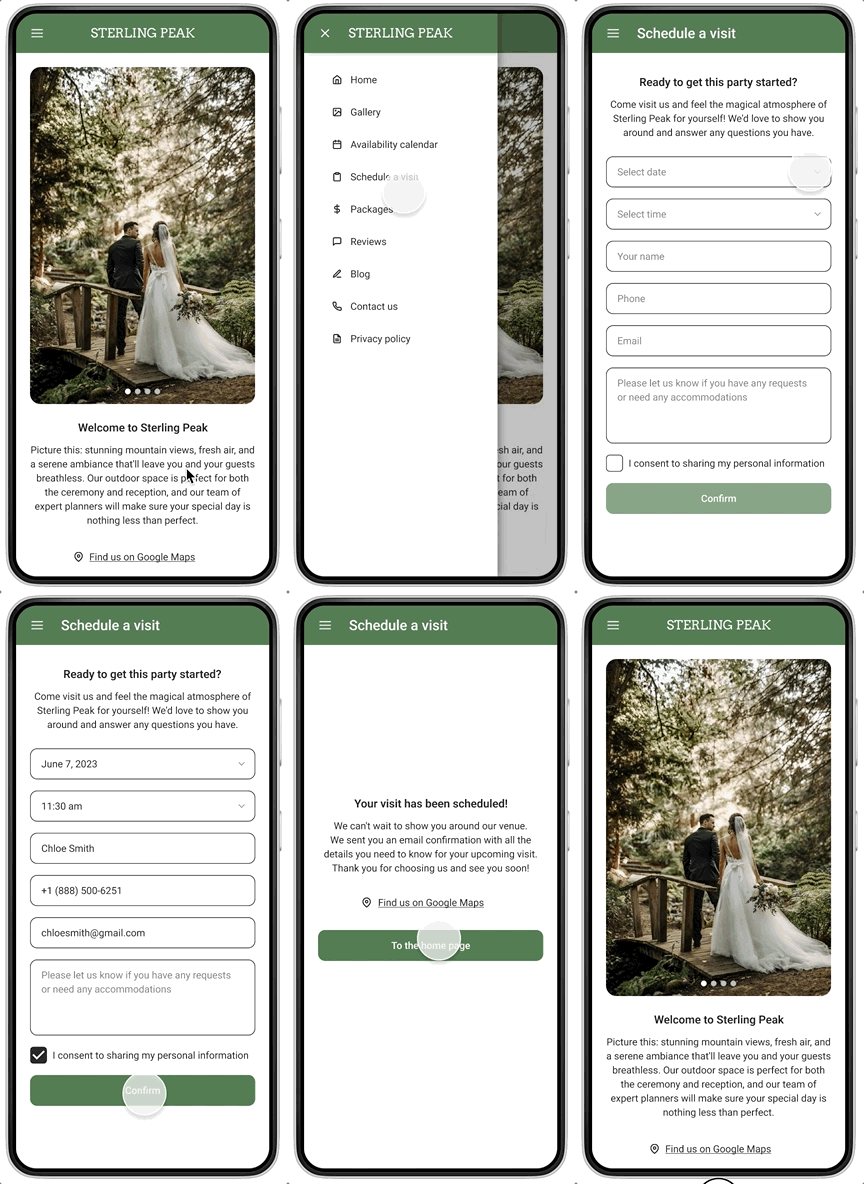
Scheduling a visit
Users are encouraged to check out the venue in person and meet with the Sterling Peak team before they book it for their wedding. I designed a simple scheduling flow so it takes a minute to schedule a tour of the place.
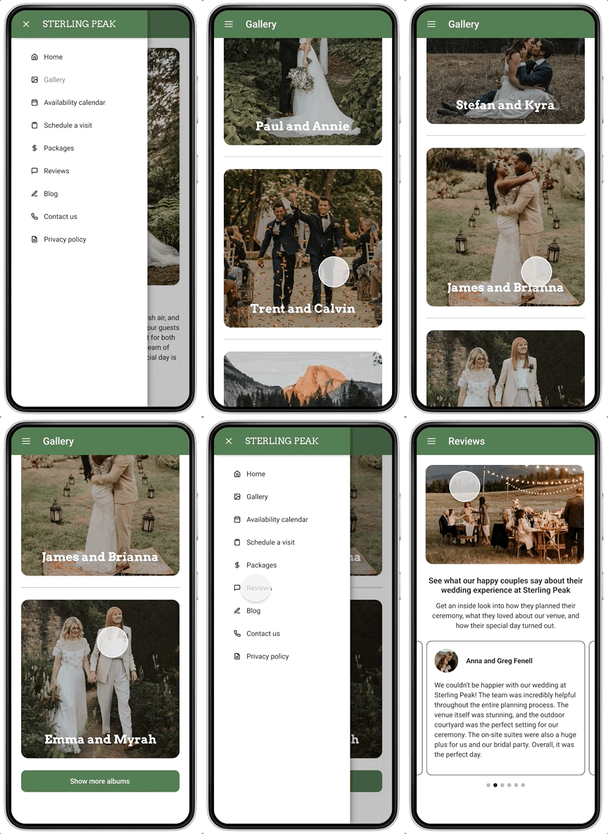
Browsing through pictures
Users mentioned that they wanted to see more photos of real weddings held at Sterling Peak, not just pictures of the venue itself. I created albums with couples’ pictures, ensuring the inclusivity of underrepresented and marginalized groups.
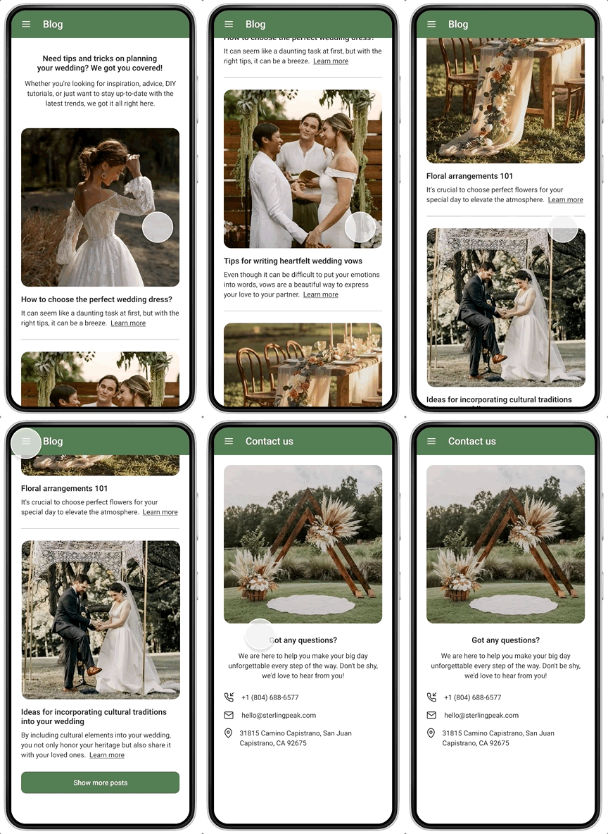
Catching up on wedding trends
I created a Blog page where users can browse through dozens of posts written by industry experts to draw inspiration from and get helpful tips and tricks on making their wedding day immaculate.
WHAT I LEARNED
In conclusion, I am excited to share that through meticulous user research, an iterative design process, and incorporating user feedback, I have created a solution that truly helps engaged couples find answers to all possible questions and select that perfect outdoor venue for their special day. Designing an app for Sterling Peak was a very enjoyable project for me to work on, and I am grateful for the opportunity to have learned and grown through it.
Key lessons:
I learned that creating an inclusive and accessible solution should be the top priority throughout the design process. It is crucial to empower all users, regardless of their abilities, to effortlessly engage with the app and have a delightful experience. Following accessibility guidelines and promoting diversity should serve as the foundation of any product.
1
Conducting a competitive audit proved invaluable, helping me gain insights into the strengths and weaknesses of competitors and get inspiration for creating an agile and compelling product. I believe this research method played a pivotal role in guiding my design decisions and positioning the app on the market.
2
In the world of design, things are always changing and evolving. It's crucial to stay up-to-date with the latest trends, tools, and techniques. This project reminded me of the importance of continuous learning, trying out new design methods, and seeking opportunities to grow my knowledge and skills.
3
Thank you!
I hope you enjoyed learning about this project as much as I enjoyed working on it 🙂


