Intuitive account creation experience
Role: end-to-end UX design
Duration: 3 weeks
Tool: Adobe XD
PROBLEM
A complicated sign-up process on a networking platform for designers discourages users, providing a negative experience from the start.
Many designers seek a place where they can connect with like-minded professionals. Existing platforms often require users to go through countless steps and provide an overwhelming amount of information. The experience leaves them frustrated, alienated, and, ultimately, disengaged from the platform. As a result, the platform fails to attract and retain valuable members, hindering its ability to facilitate meaningful connections and collaboration.
GOAL
The goal of the project is to create an efficient and straightforward sign-up flow to foster engagement and create a seamless onboarding experience for designers, empowering them to quickly join the community and leverage the benefits of the networking platform.
AUDIENCE
The audience includes designers from various disciplines, including graphic designers, UX/UI designers, industrial designers, and more. They are passionate about their craft and are seeking opportunities to connect and collaborate with others. They value networking as a means to enhance their professional growth, gain inspiration, and stay updated with industry trends.
USER RESEARCH
I conducted interviews with experienced designers and those who are new to the field in order to gain insights into their challenges, expectations, and preferences regarding the process of creating a new account on the platform. Through in-depth analysis of qualitative and quantitative data, I identified common pain points and user needs, which helped me make informed design decisions in the next phases of the design process.
Bree
Product designer from Seattle, WA
Anika
UX Bootcamp graduate from Houston, TX
Noah
Motion Designer from Anchorage, AK
Key research findings:
Simple sign-up process
Many participants expressed frustration with existing platforms that featured lengthy and complicated registration processes. They mentioned that multiple steps and excessive information requirements were discouraging.
Clear, intuitive interface
Participants highlighted the importance of easily comprehensible instructions, clear user interface, visually appealing design elements, and logical progression through the steps if there is more than one.
Addressing data privacy
Some designers raised concerns about data privacy and security during the sign-up process. They emphasized the need for transparent data handling practices and clear privacy policies to establish trust in the platform.
Mobile-friendly experience
Participants mentioned that they’d like the website to be responsive and mobile-friendly, accommodating the needs of designers who prefer to use smartphones and tablets for their work.
USER FLOW
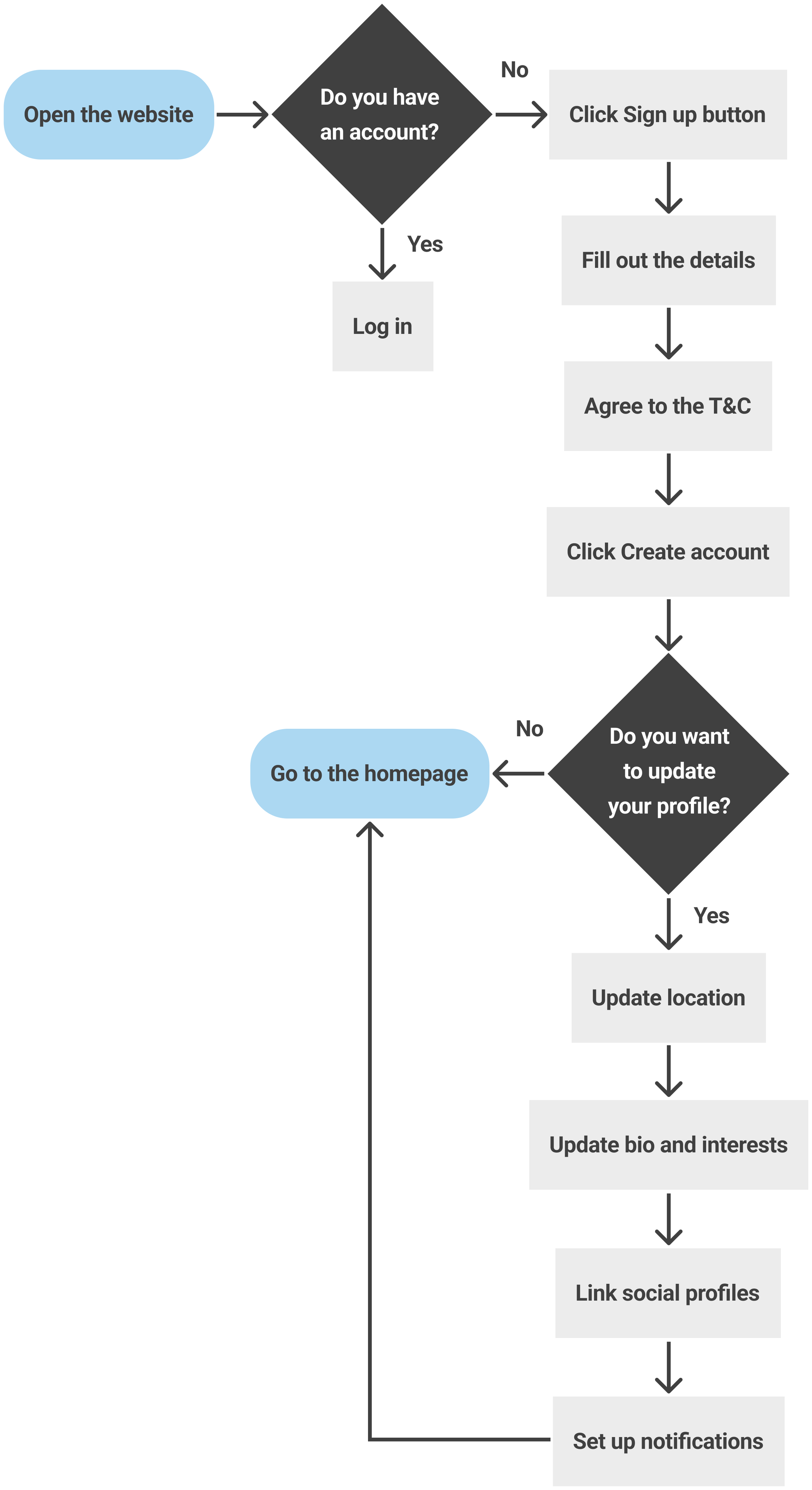
Based on the insights I gathered from user research, I decided to create a one-step sign-up process with minimal information requirements, that allows users to get access to the platform right away and customize their preferences as well as update profile information after the account has already been created. I created a user flow to visualize the steps users needed to take to create an account and update their profile.
DIGITAL WIREFRAMES
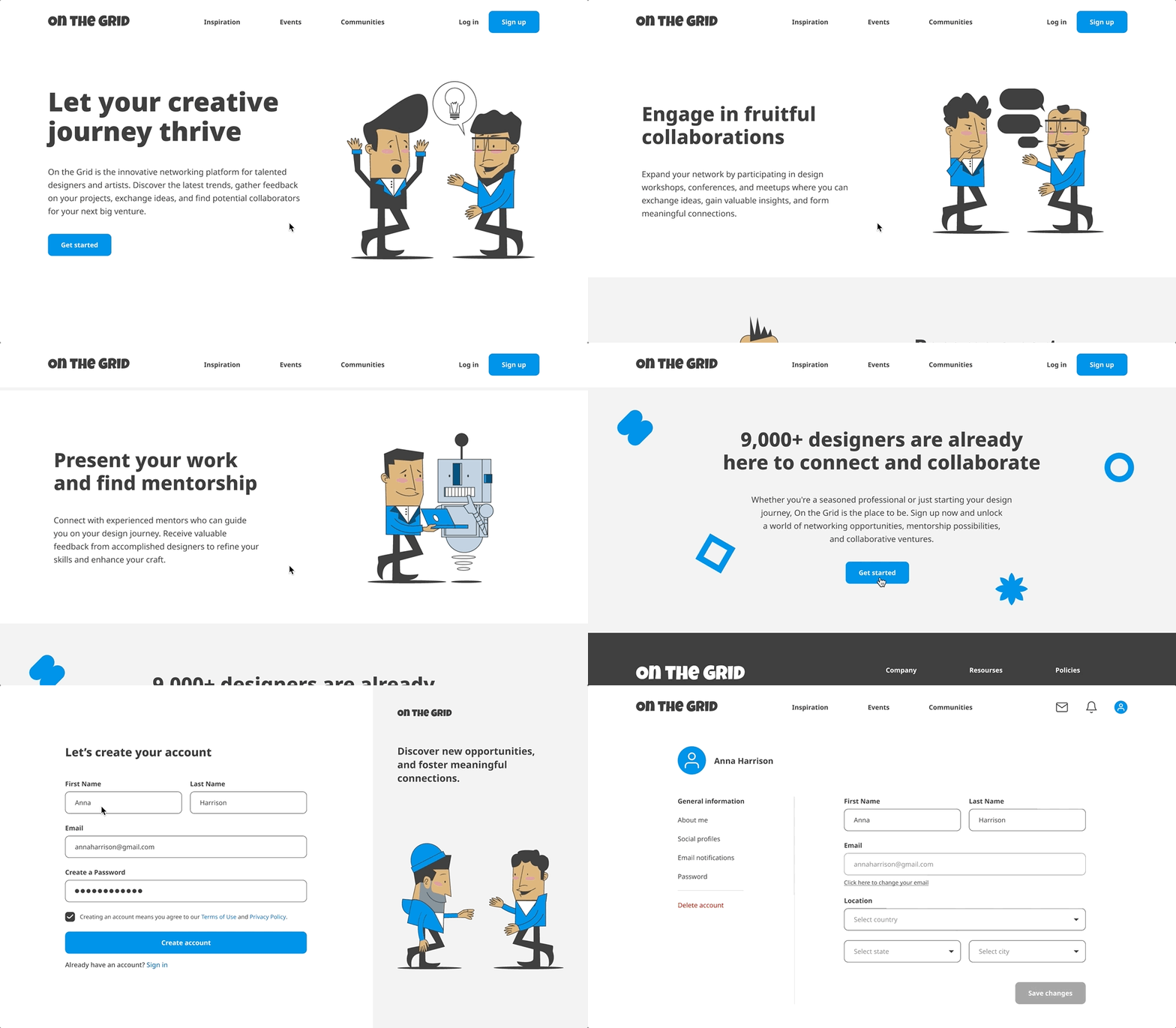
I started my creative process with sketching as it allowed me to play around with page layout and element placements. After getting the initial idea of how I want the product to look and feel, I created digital wireframes in Adobe XD and added interactions so that I could have a prototype to test with users.
USABILITY TESTING
Testing the prototype was a crucial part of the design process because it allowed me to get real user feedback before finalizing the product. I organized moderated usability testing sessions where 8 participants interacted with the prototype and tried out the sign-up flow. Their feedback helped me identify areas where the user experience could be improved and make iterative changes to the prototype.
Usability testing results:
Originally, I wanted to name the platform “Mingle”, but I received valuable feedback from the participants that that name might have a romantic connotation and would better suit a dating app rather than a professional networking platform. I decided to change the name to “On the Grid” to make it more design-related but still fun.
1
Users mentioned that they would prefer to be directed to the profile page after creating an account instead of the homepage. This way they can update all necessary information in their profile, and select their design interests and networking goals, which will help them customize their feed from the start.
2
Participants noted that it would be helpful to have active links to the Terms of Use and Privacy Policy on the sign-up screen instead of having to look for those in the footer in case users wanted to skim through the documents.
3
DESIGN SOLUTION
I carefully reviewed all the feedback I received from the usability study participants and iterated on the designs to make sure that the user flow is simple and straightforward. Through multiple iterations and testing cycles, I refined the user experience, ensuring the final solution met user needs and expectations.
Quick sign-up process
I placed three call-to-action buttons on the homepage, by clicking on which users can create an account in under a minute.
Customized experience
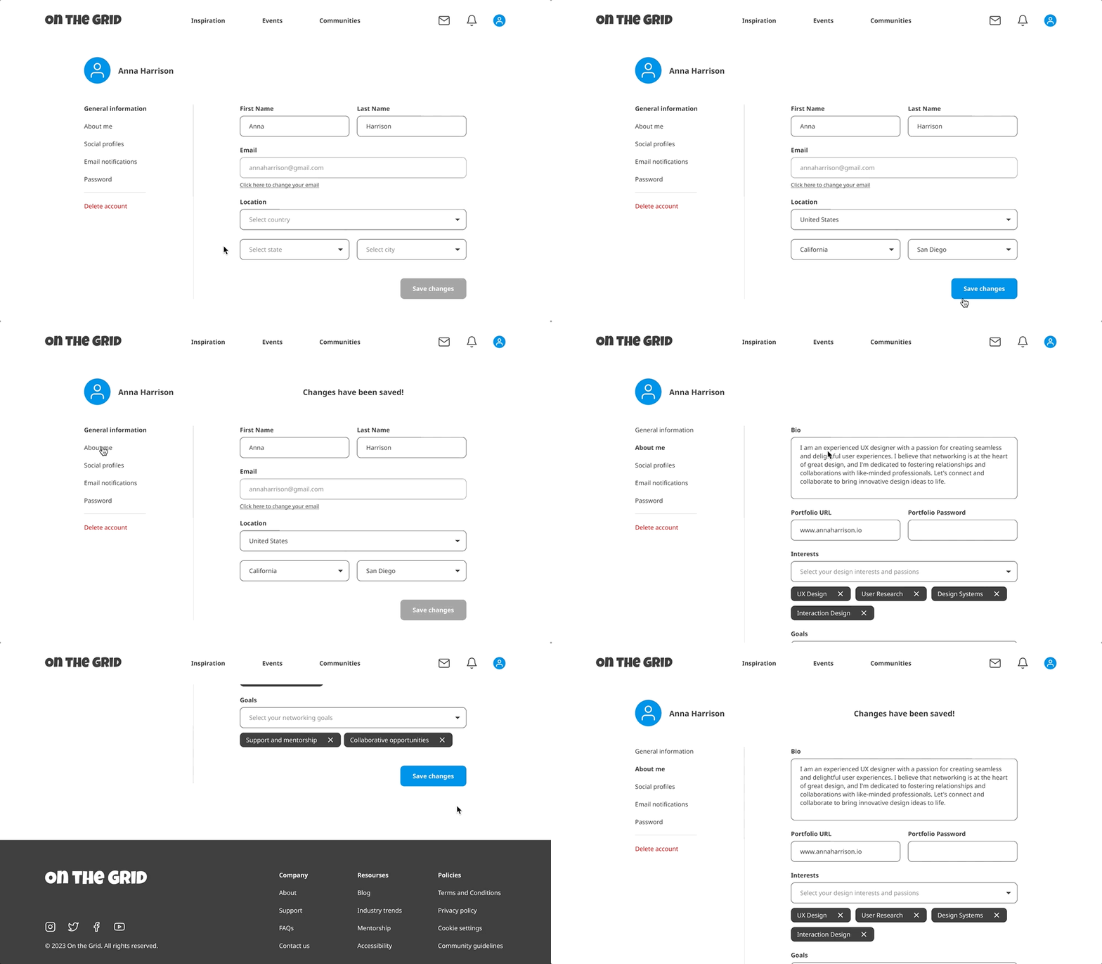
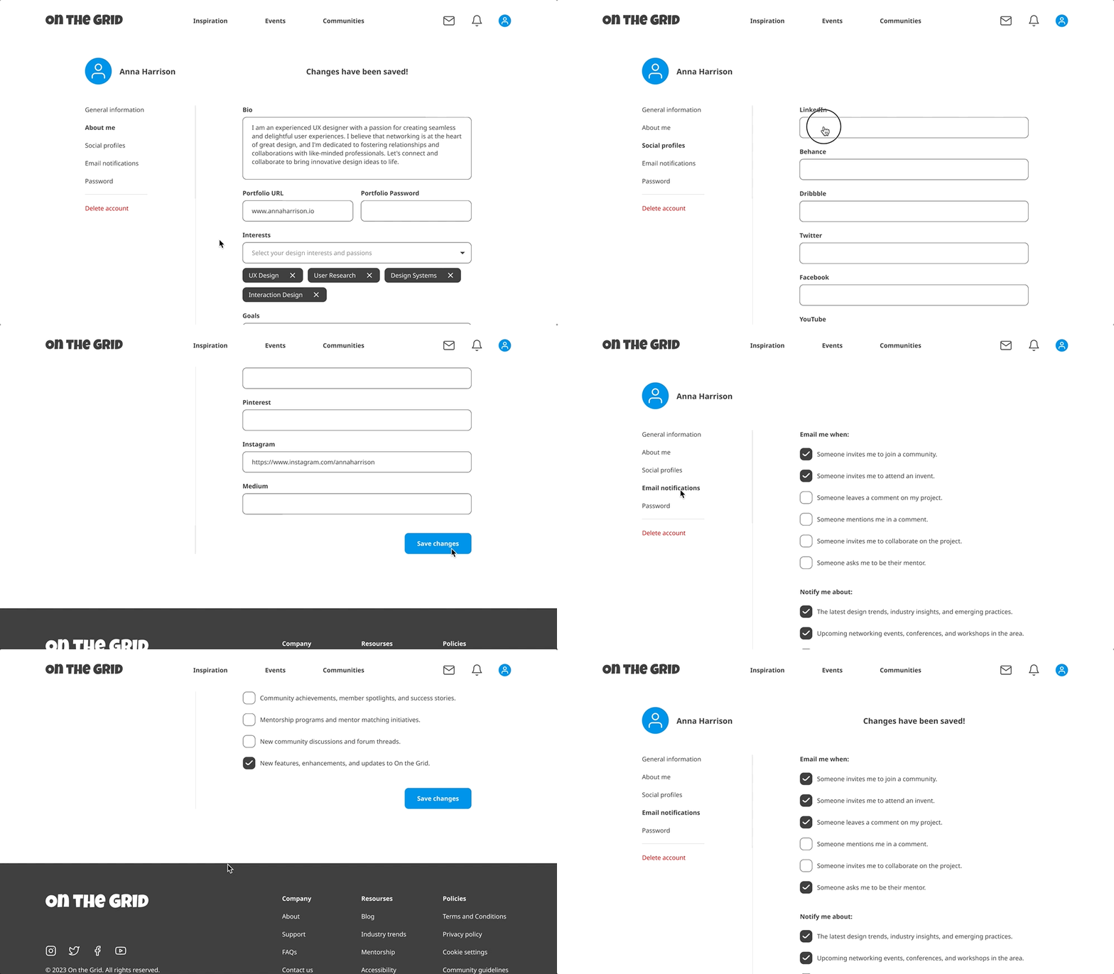
I wanted to help users tailor their journey on the platform to their needs by adding a location, interests, and networking goals.
Optional settings
Users can level up their profile by linking their social media accounts and customizing what notifications they’d like to receive.
Account management
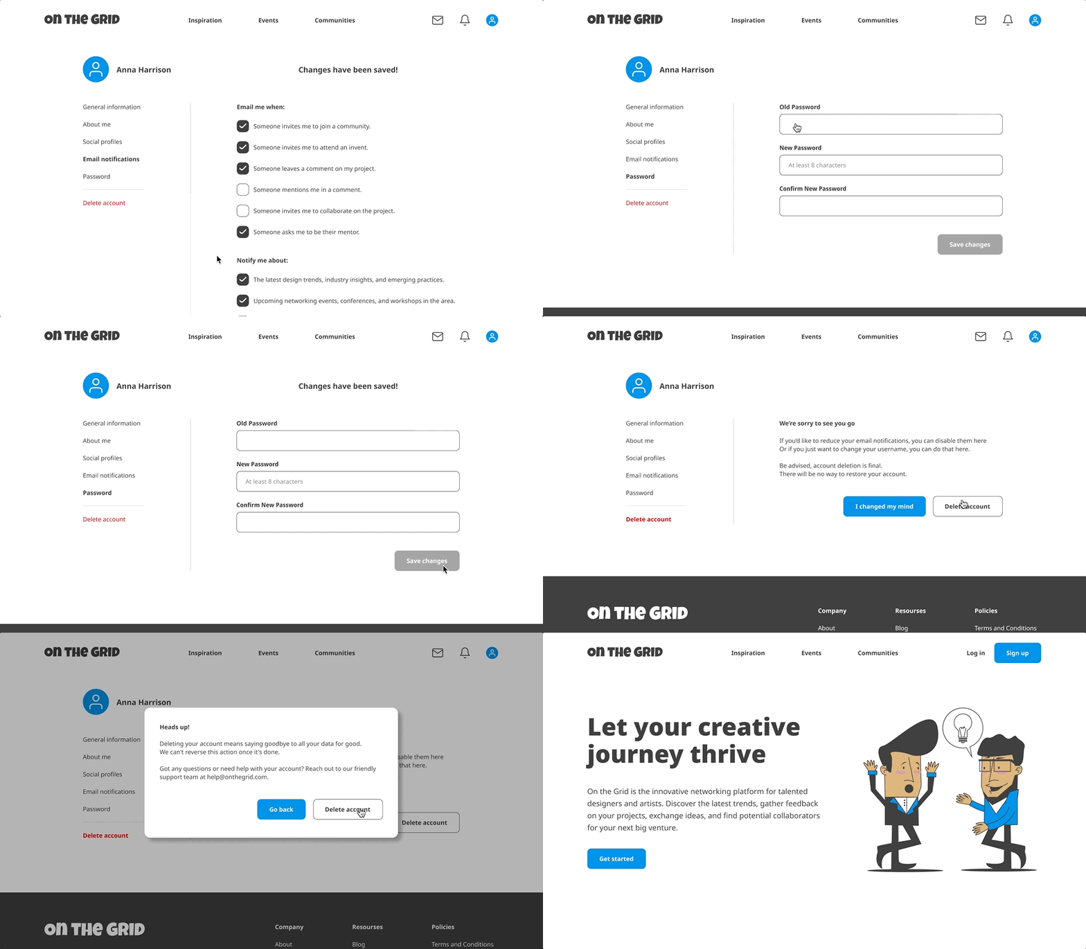
Users can easily change their password or potentially delete the account altogether without reaching out to the support team.
Seamless mobile experience
I prioritized creating a responsive website from the very beginning and providing an intuitive user experience across different devices, whether it's a desktop, laptop, tablet, or smartphone.
WHAT I LEARNED
Working on this project has been a very rewarding journey for me. By conducting user interviews, incorporating valuable feedback, and iteratively refining the designs, I have been able to develop a truly user-centric solution. I believe it was the right choice to create a simple one-step sign-up process that lets users access the platform, and then give them an opportunity to update and customize their profile to create a seamless, tailored to their needs experience.
The key takeaways for me were always being open to any user feedback, iterating on the designs as many times as needed, and not becoming overly attached to any idea or design solution. When I was able to put aside my personal feelings about the initial design concept, I was able to embrace constructive criticism and come up with new insights, which led to a more successful and user-centric outcome.
Thank you!
I hope you enjoyed learning about this project as much as I enjoyed working on it 🙂


